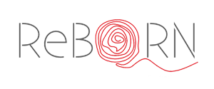
Form :
The womb, the source of Reborn is made up of a fine single thread. The phase of Reborn arrives
between the period of one's birth and death. When one undergoes through the process of Reborn,
this cycle of birth and death breaks open which is depicted through the opening up of the thread.
This thread is the most important element of Reborn series which serves to explain the dynamics of
relationship during the process of Reborn.
Font :
The typeface of Reborn is as delicate as the thread with intersections found between the letters.
The intersections represent the inevitable break from the mundane which is required to achieve the
state of Reborn. The prefix 'Re' and word 'born' come together as a single word in uppercase.
Color :
Reborn is represented by two colors - Red and Grey.
Ever wondered what is the color of birth? What is the color of death? When I think of color of birth,
I think of white and color of death as black. Reborn is a phase between life and death.
Hence, Grey colors the entire typeface. Reborn is a phase of revolution, action and energy.
Red is the color to convey the power of Reborn.
In entirety, Reborn brand identity well assimilates the core essence of Reborn philosophy.
comments powered by Disqus